MSEM
As part of a school event (about math/science/arts), I did some design work, mostly for social media, including promotional material and the logo.
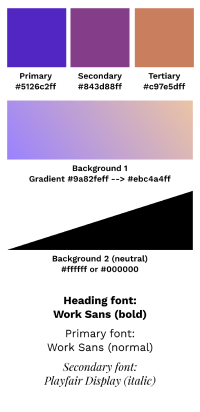
This figure was made about a year ago, and some things in this just ain't right. Regardless:

Looking back on this, over a year later, there's one thing lacking: consistency. There's some, but it's not much, and everything looks all over the place. I find it a bit funny because I made a whole point of creating this thing:

Primary/secondary/tertiary colours make no sense whatsoever. I recall being a bit hesitant with which colours to use for specific purposes. The only times I used these colours was in a gradient for the foreground.
There is a notion of consistency with most of the Instagram posts. It's not great but it is there. I think the problem was not landing on a consistent style of design before making everything. You can see a clear difference between the way the category details posts were designed and the way I did the event schedule. Gradients on the text, the colouring of the text, so on and so forth.
Then comes the concert announcement. Complete change in style for these, and for no apparant reason! This definitely could have been done in same vain as the other posts.
The concert ticket is fine in a vacuum aside from the blending of the images. There are very visible seams and they do not look good.
The directorate ID cards are alright; black is somewhat understandable. The host team ID cards? Blue! Makes sense.
I suppose it's alright for a first. It could have been a lot better though.
The word shown here was done through October/November of 2022. If you have any thoughts, feel free to send me an email with them. Have a nice day!