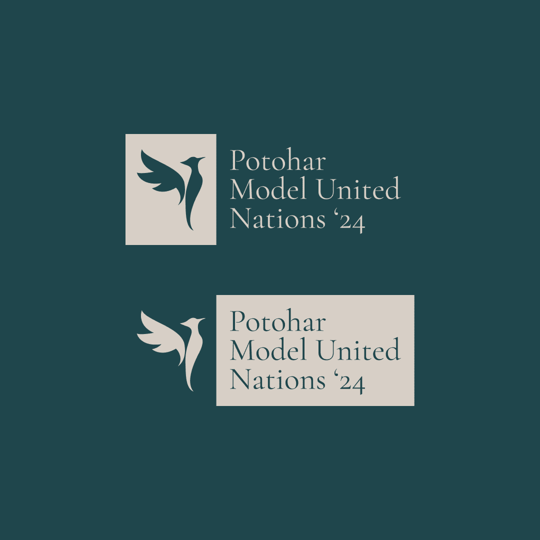
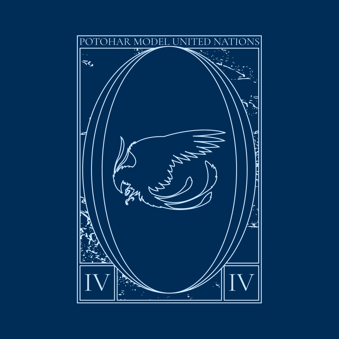
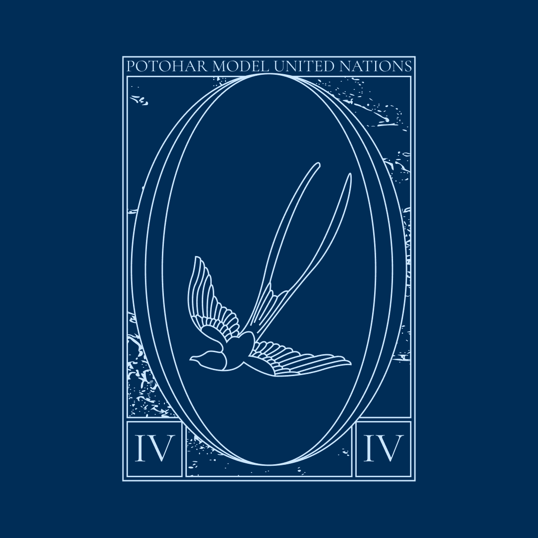
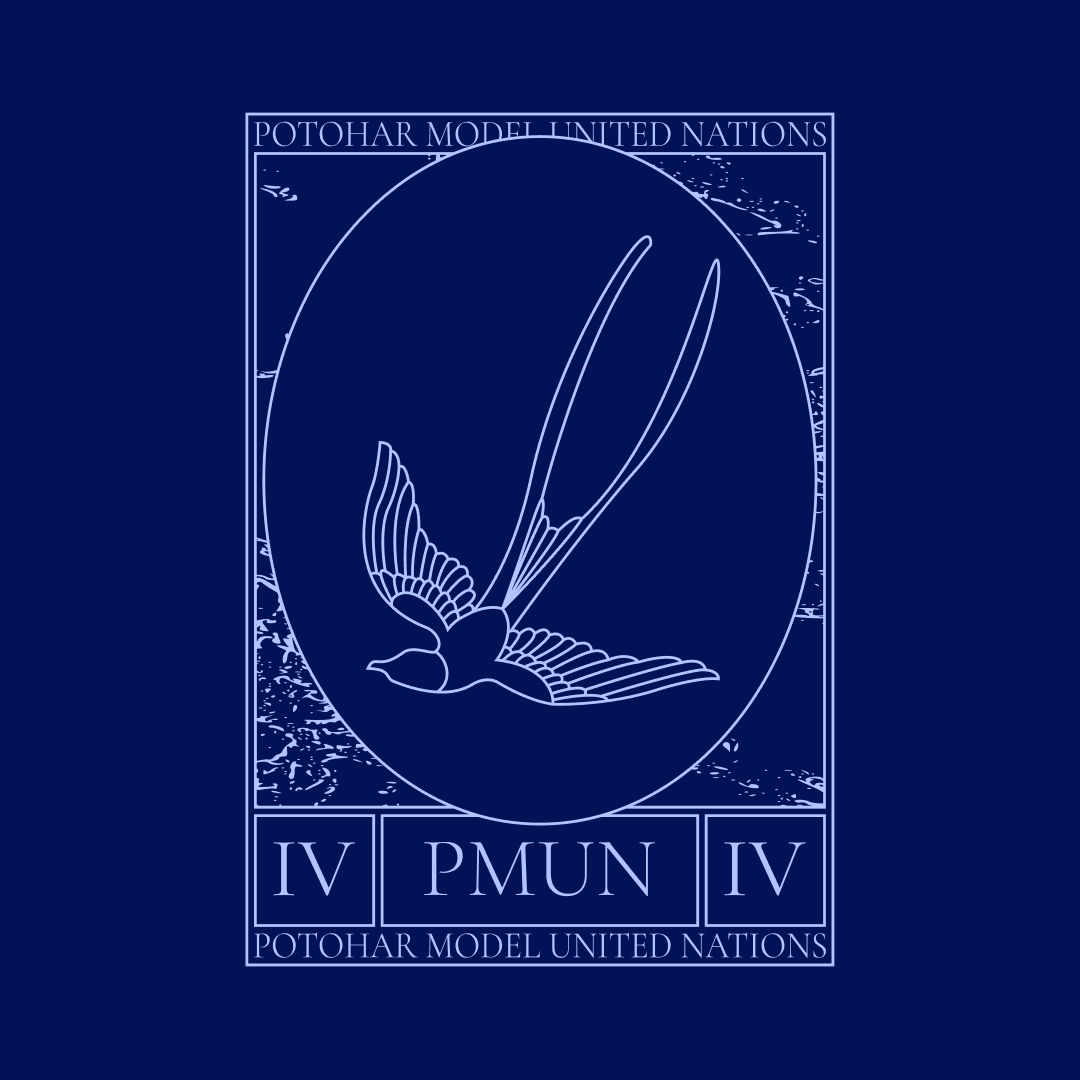
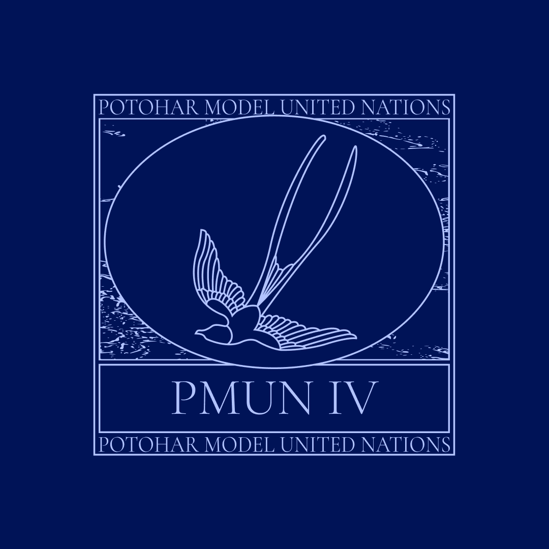
Potohar Model United Nations IV: The Logos

I know for a fact that I made a lot of logos for this event. It didn't work out, but I digress. I don't like a lot of these logos, or there are specific things I don't like in some of them, but I'd still like to put them here.

Probably my favourite. The bird is a modified version of a bird a co-director made; I think it could use some work.
I have a special hatred for this logo, but everyone else seemed to like it!
Very problematic bird. Full disclosure: this and the bird after were made by tracing an image. I'm not very proud of that, but it needs to be said.
Very problematic bird, yet again.
Second favourite.
Extremely average and rather unappealing. Same goes for the following.
The bird is not mine! It's slightly modified from one the same co-director made.
Honestly, I do not like this. I particularly dislike the background and how "smooth" everything looks. Also the head of the bird.
I did not make the majority of this logo, I got it from a different co-director. I did make plenty of tweaks, however, plenty of them.

This article was written on 04/01/2024. If you have any thoughts, feel free to send me an email with them. Have a nice day!