What Have I Done to this Website?
Another redesign! What did this aim to do? Put simply,
- Reduce the amount of "code" in the template
- Load faster
- Easier maintenance
I mentioned in About this Website:
"This entire website is written in plain HTML and CSS. No CMSs or static site generators have been used. There are cons to this approach, but the simplicity (not speed) of maintaining such a site is very appealing.
I have a template HTML file, into which I insert the contents of any new articles. The drawback of this approach is (a) it's slow; and (b) tweaking the template file is something that requires a bit of time, since I have to translate the changes to all HTML files that are based off of the template."
It turns out that there are levels of simplicity. The site before this was indeed simple to maintain, but it was on the lower end of the simplicity spectrum. This redesign aims to be higher on that.
Also, I like the simplicity of sites like sive.rs.
The Benefits
The gist of this redesign is to make this site simpler to update while still writing in plain HTML. I don't need to copy/paste entire divs anymore to list an aritcle; I do that in a simple unordered list.
Next, I reduced the amount of CSS from about 400 lines to just 71. CSS is particularly difficult to maintain, because no matter how many comments you add, you never know exactly how it works. It just becomes a bit of a mess. Besides, I want to write in plain CSS; I don't want to use SASS or Bootstrap or Tailwind or whatever. Custom fonts are also gone. This site will use your browser's default serif font (you can probably change that in its settings).


This means the site will look pretty different depending on default fonts.
Moreover, by keeping it pretty vanilla HTML/CSS, page zooming does not ruin the appearance of the page. There's very little layout to ruin.
Why don't I just use a static-site generator or CMS?
I find enjoyment in my current workflow, for whatever reason. I have some reasons to try them out, but none of them are compelling enough for me to make that change.
The Drawbacks
The most glaring drawback of this new design is its appearance. To be a bit blunt, it's not pretty. Definitely not. But it's not ugly, and more importantly, it remains usable.
Mobile usability may suffer (I haven't tested that yet, not as of the time of writing). I may look into larger touch targets in the future.
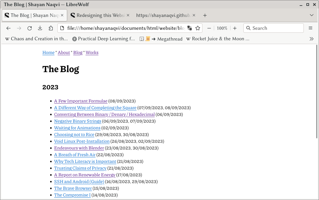
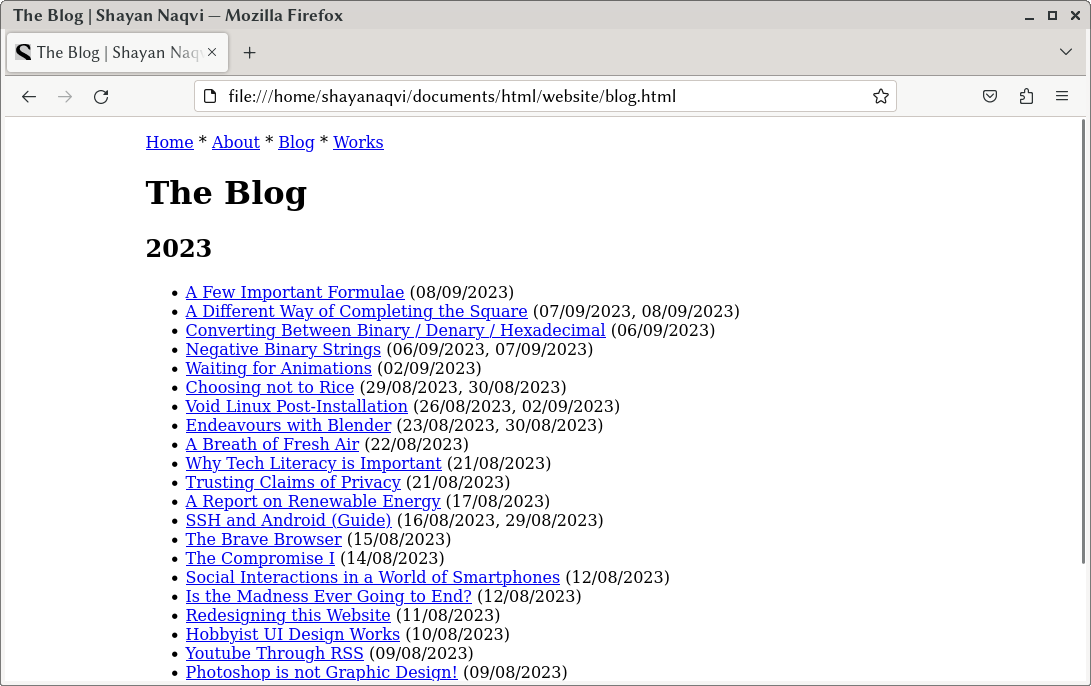
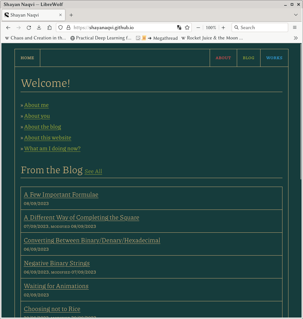
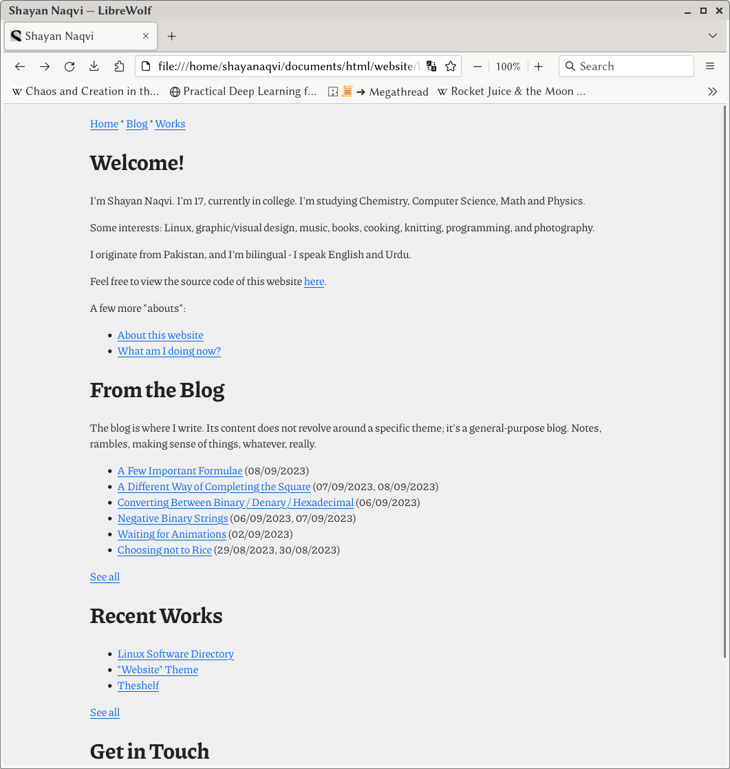
Here's a quick before/after:


Let's see how long this lasts.
15/09/2023: Not even a week. But anyway, CSS is still pretty minimal. I think it still is in line with what I was trying to do.
This article was written on 10/09/2023, modified the following day and on 15/09/2023. If you have any thoughts, feel free to send me an email with them. Have a nice day!