The Nobelium Cup
The Nobelium Cup is a multi-format sports tournament, put simply.
I'll put most things I did here, what I won't put are all of the Instagram posts. If the page is still up in its current form (as of February 2024), you can view all the posts here. Any videos on this page are not my work.
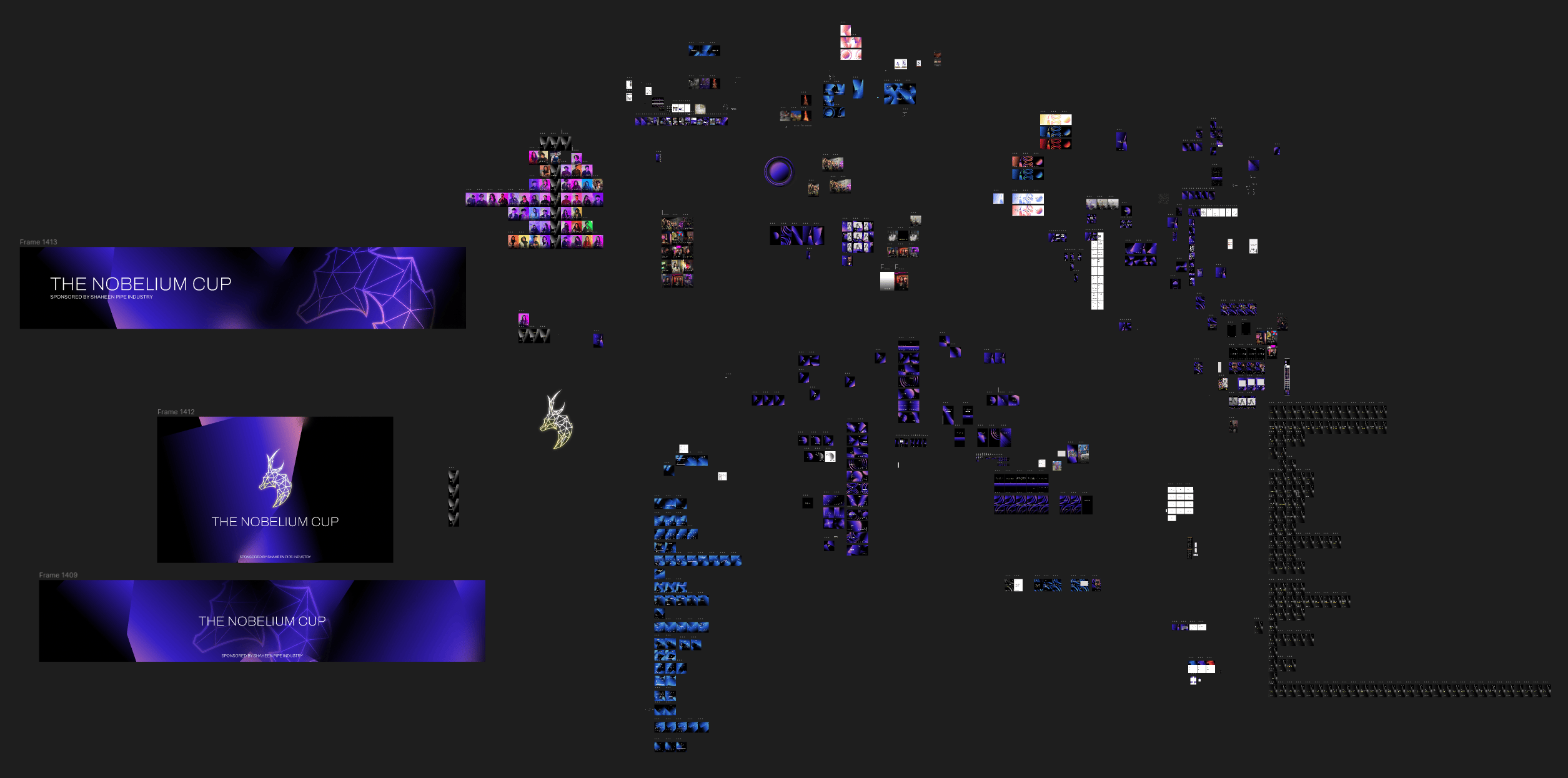
I did all of this work in Figma. Here's a screenshot of the end-point of this file:
I thought there'd be a tad bit more here.
All things considered, I'm happy with the way this turned out. Definitely an improvement over the way things went for MSEM and the way things would have gone if PMUN was a thing.
It isn't perfect, and there are things I'm not happy with, but again - net positive. The style of design I went for works when it works, but when it doesn't work, I think it really doesn't work. That's my main sticking point.
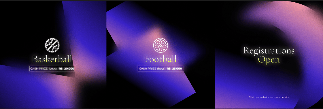
1.0: The Instagram Posts
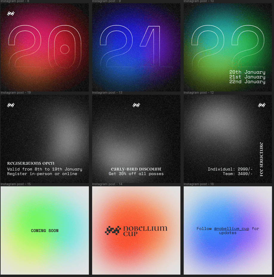
One of the things I wanted to avoid was the background continuity thing between posts on the grid. While that sorta page does look nice, it's a lot of work to maintain that layout. Whenever you need to post something, you need to post in batches of 3. The page we did for Nobelium was a mix of these. I wanted all posts to work on their own with no continuity between them, different backgrounds and all. It started off that way, but I did not follow it throughout.
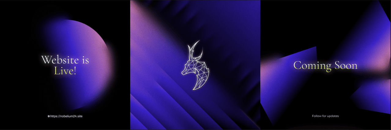
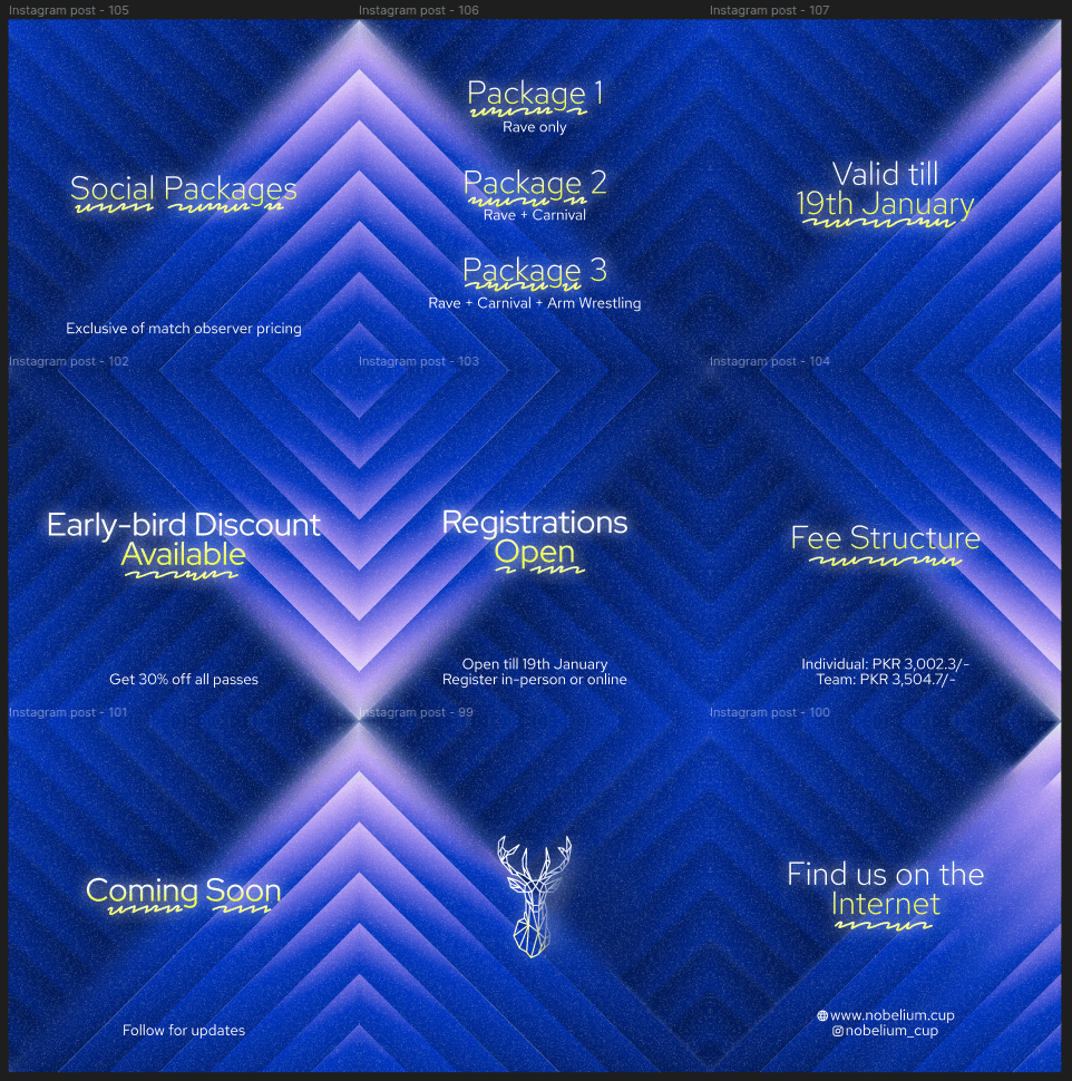
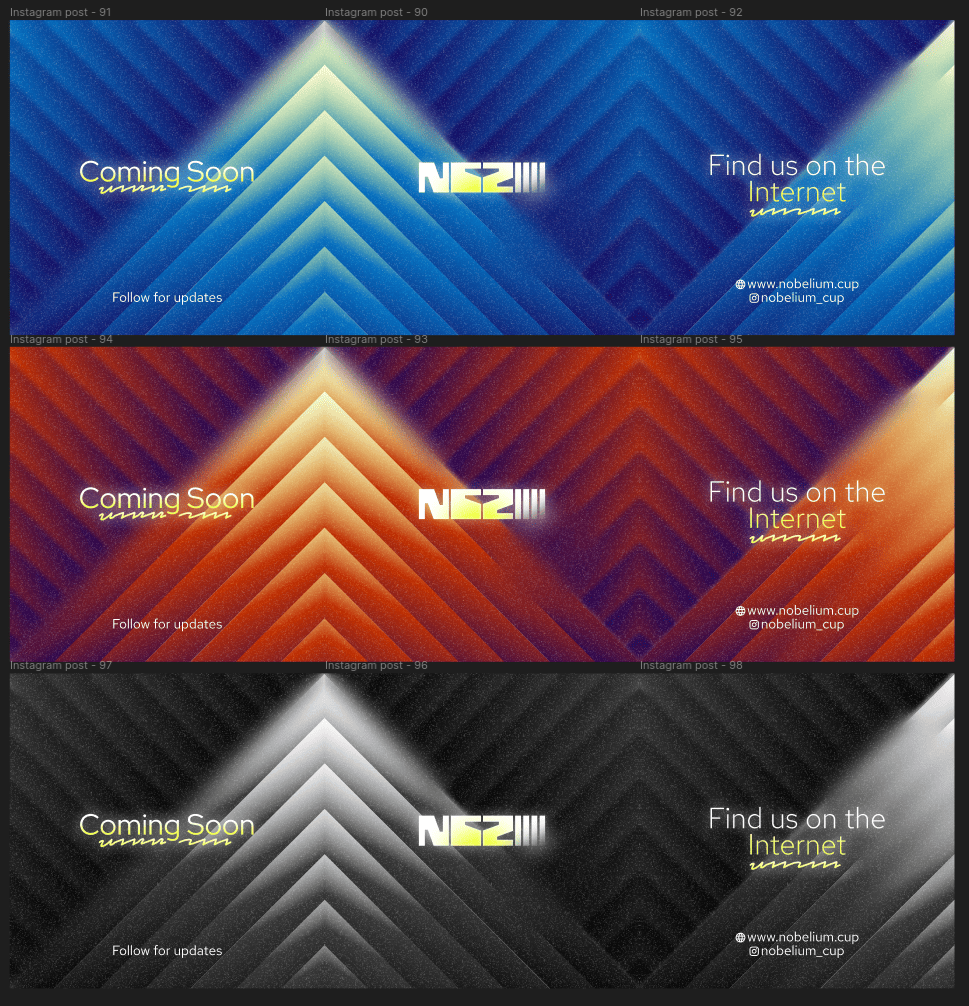
This is what I was going for. My mistake here was not stress testing this style of design. You can only make so many of these kinds of backgrounds before you start recycling some or modifying old ones. I'm going to admit - I did do that.
By the way, I got my inspiration for this kind of design from this page on Behance. I genuinely love it.
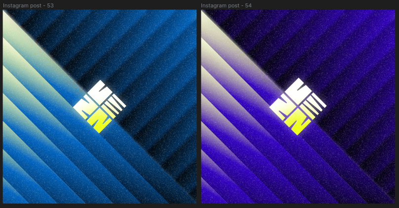
I'm going to briefly touch upon the logo. I don't hate it, for a change. However, I still don't like it. There were, 100%, problems I had with scaling this logo to smaller sizes. It looked just fine medium or large, but it had problems small.
This was the second round of posts we uploaded. It was at this point I did begin to question whether I made the right choice with this kinda design. I genuinely hate these 3 posts. You know you've done something wrong when you start doubting it this early.
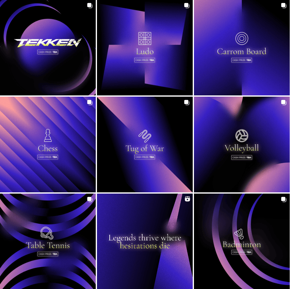
You know, for a while there, the page was a complete mess. I'm not going to say this 3x3 spread of posts looks particularly good. I don't think it does.
1.1: The Host Team
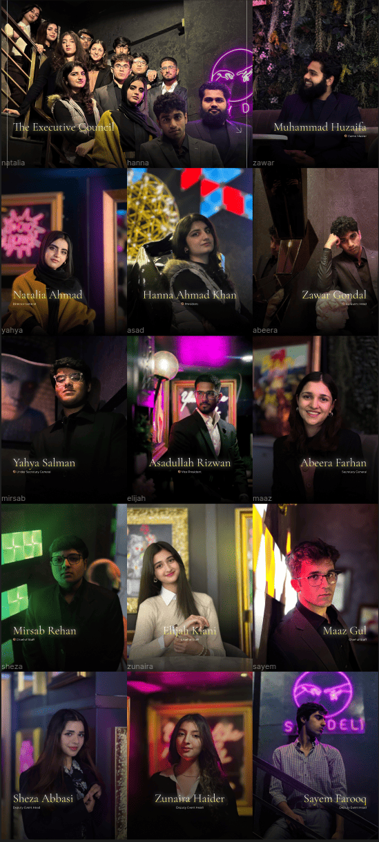
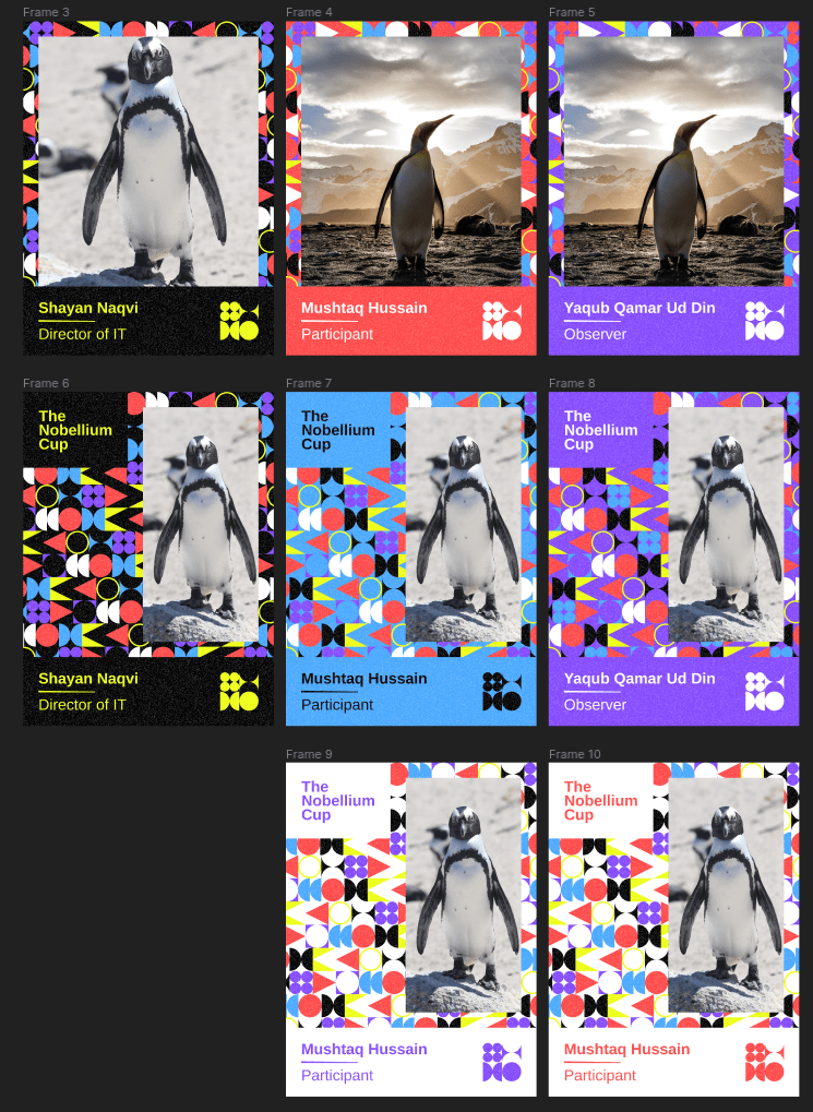
We uploaded the photos for the Executive Council (pretentious name, isn't really as pretentious as it may sound) first, before the directors. This was one of the things we did really well. The guys who took the photos are amazing photographers, and they did a great job with the actual photos.
I wanted properly minimal graphics on top of these photos. I did just that, and I think I did that well.
Here's the entire grid:
And here's one of the posts in isolation:
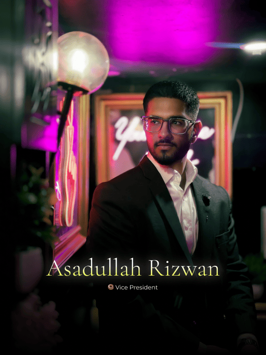
The positioning of the text is such that it isn't cropped or half-visible in the square format it is on the main page grid.
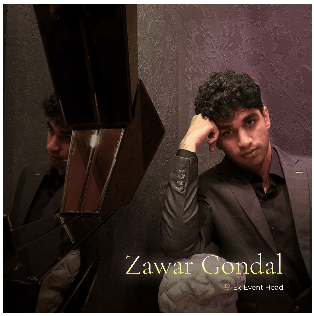
The text in the thumbnail does actually look that fuzzy. The title is kind of readable, but the subheading definitely isn't. I'm not exactly sure if that's a problem.
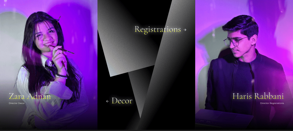
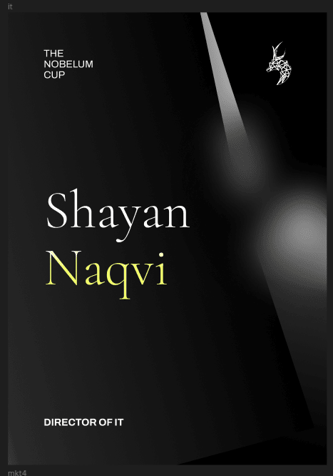
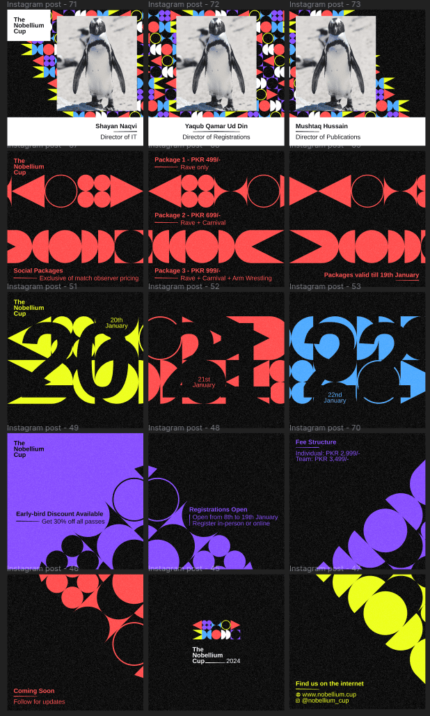
Then came the directors. Was a bit more of a challenge to get a good layout given the amount that there are, but we settled on doing slides in this sort of format:
Here's the layout at the end:
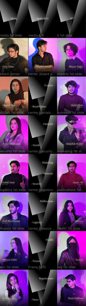
Any department with multiple directors was relegated to a slides format. I wasn't exactly happy with this, but we also didn't want our entire page to be director photos.
1.2: Changing the Colours
After posting the Executive Council photos, we changed up our colours a fair bit. The purple/yellow combo was getting a bit repetitive. It did that job though, and freshened the page up a bit.
We settled on these colours which we retained for the remainder of our page.
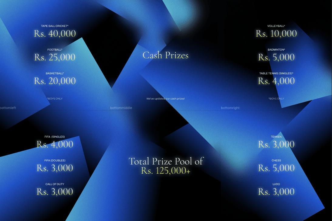
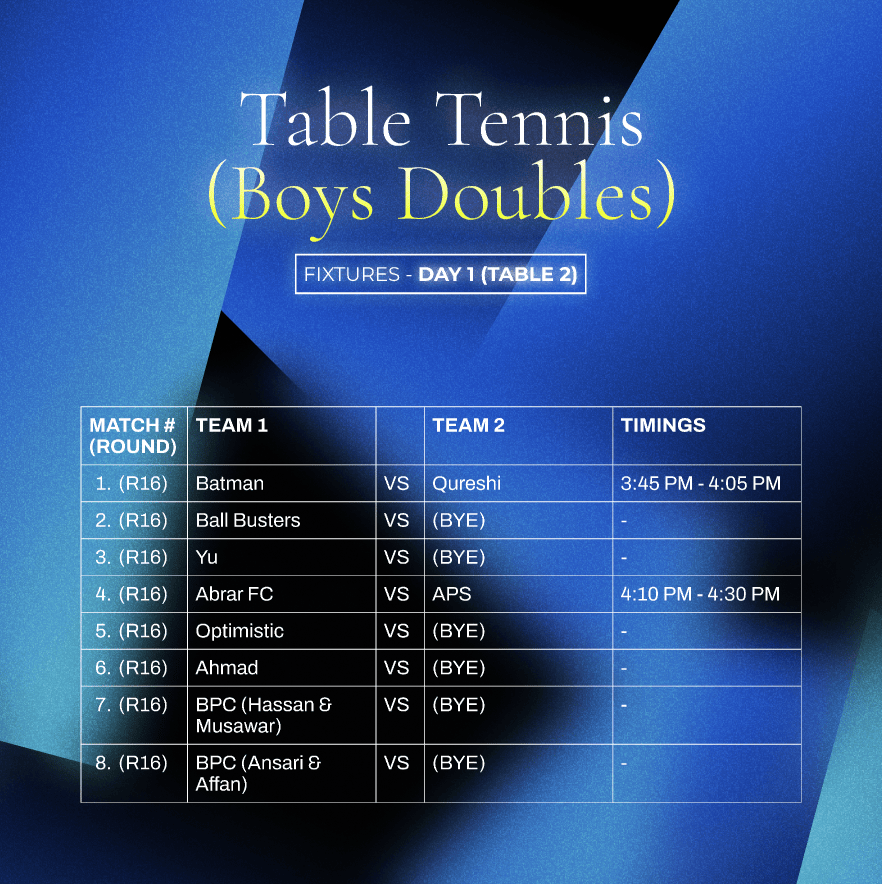
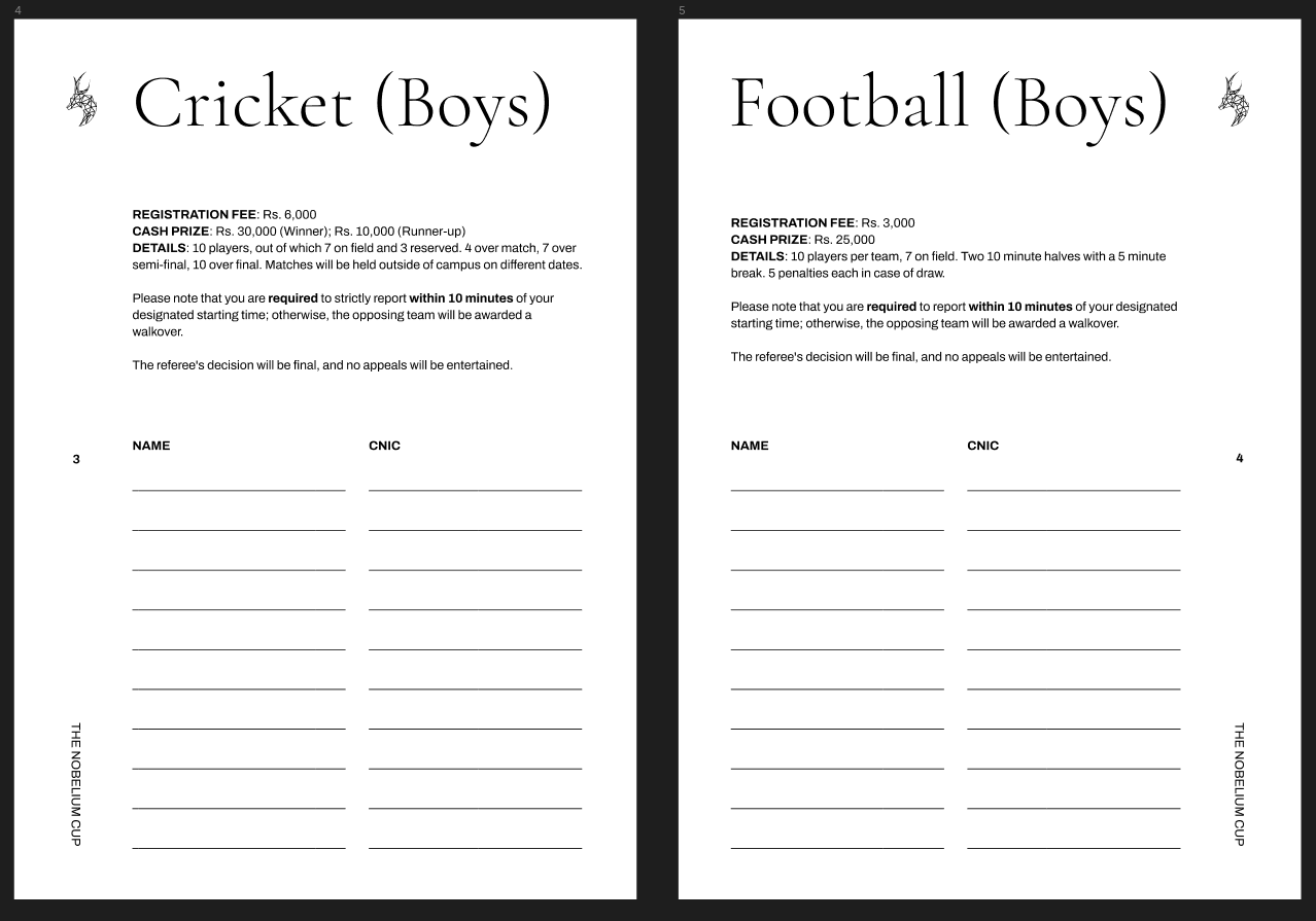
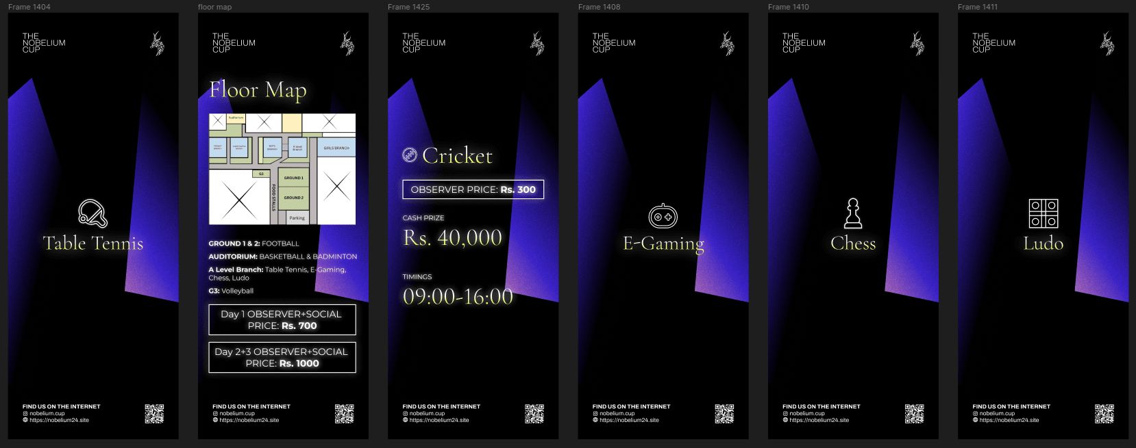
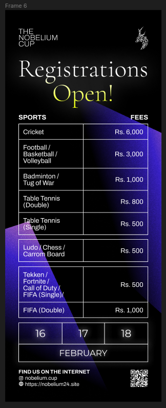
1.3: Fixtures
I genuinely thought making posts for fixtures would have been a 2 minute job, but this turned out to be quite a stressful endeavour.
For most sports, we did a simple tabular layout:
For cricket, I was convinced to attempt a different layout. Mind you, I did rush making this so things do look a bit wonky here:
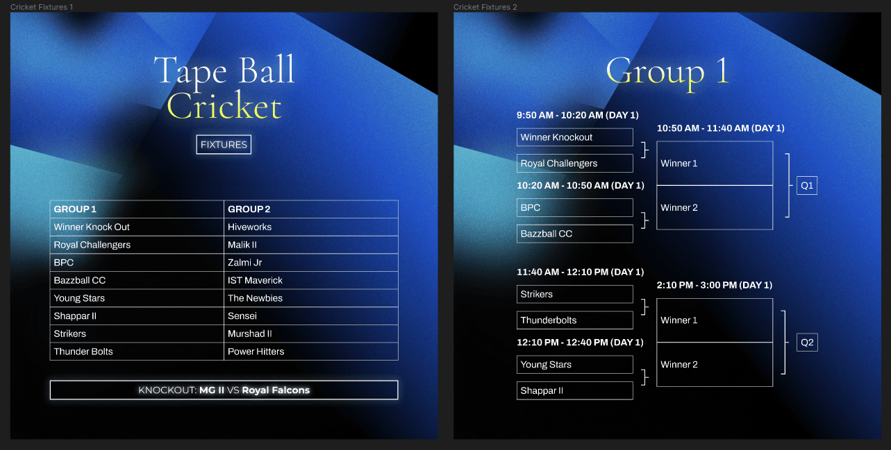
So on and so forth.
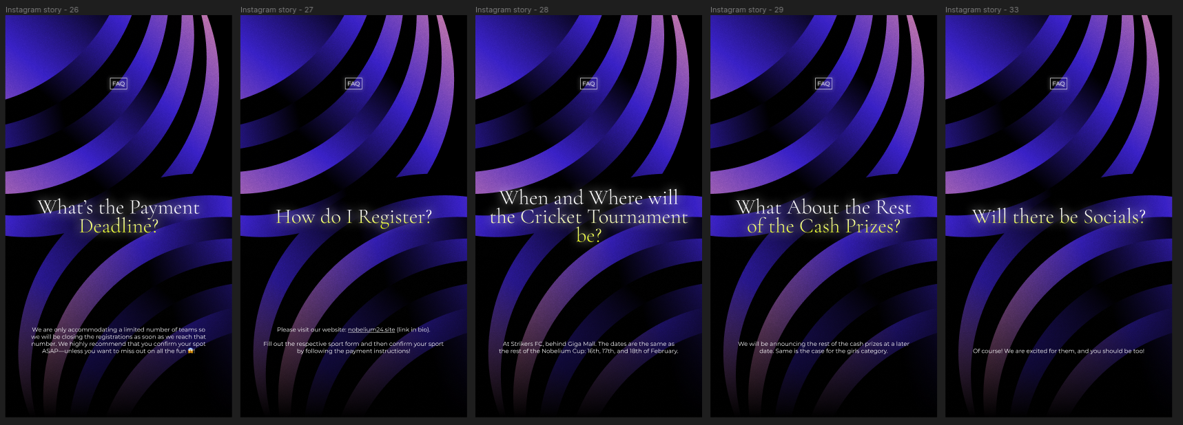
1.4: Instagram Stories
I did not have the leverage of posting all the stories on our Instagram page, and understandably so. I was able to make a few FAQ stories though.
2.0: The Invite + Sponsorship Proposal
2.1: The Invite
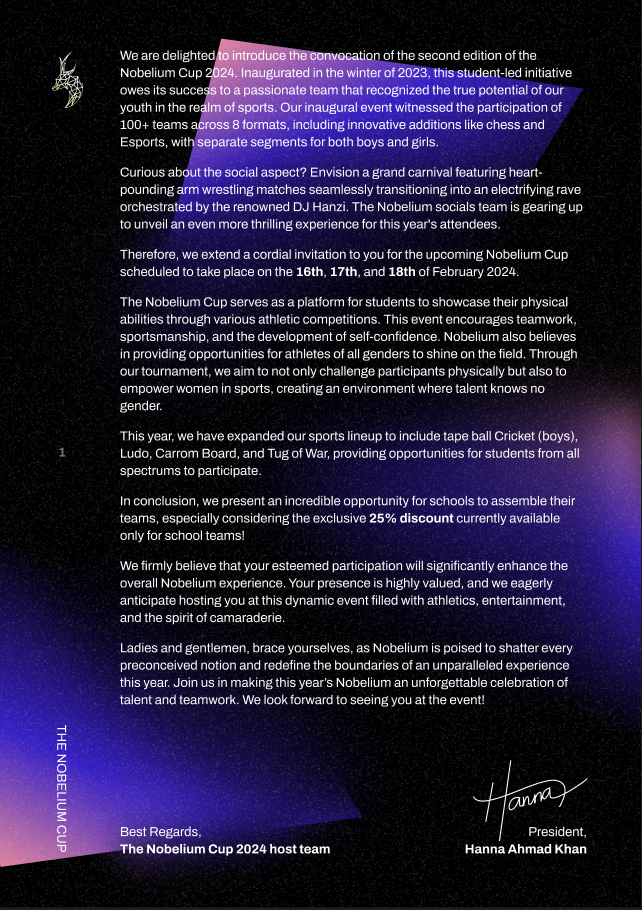
I'm going to get over with the invite first. Genuinely my first time making a printable document for this sort of purpose, it looks a bit wonky.
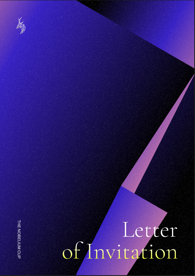
For the number of invites we were going to print, we could only afford 1 page of colour printing. The rest is black & white.
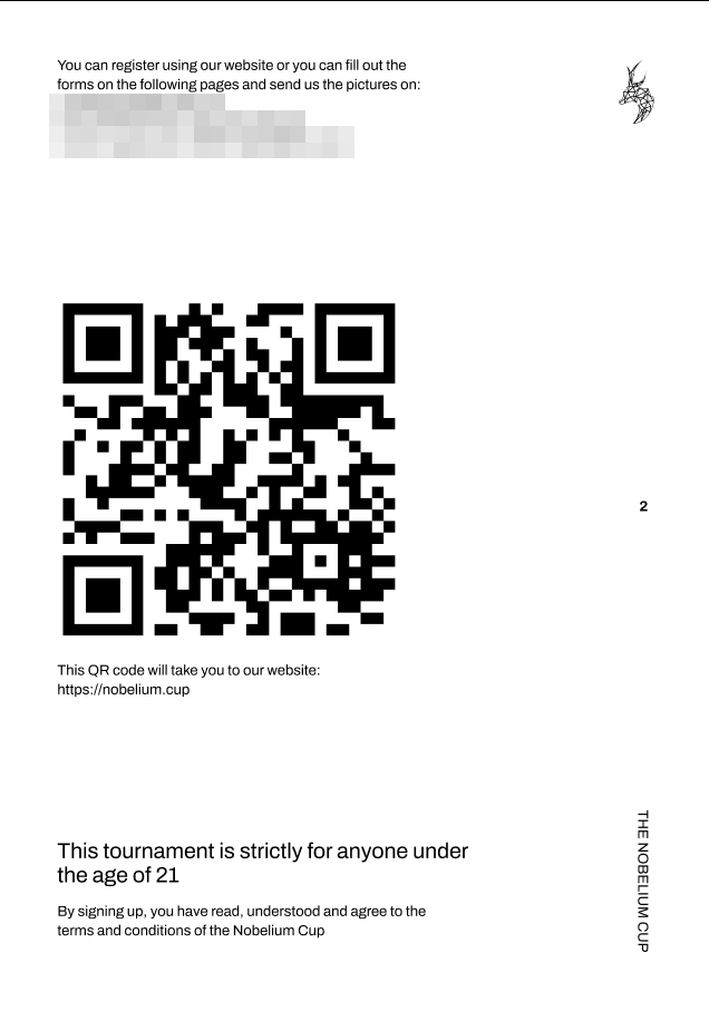
The registration forms looked as such:
It's fine. That's it. I'd call it better than the standard of event invites you get for events of this caliber in this area, but it's still not particularly good.
Moving on.
2.2: The Sponsorship Proposal
This went through two iterations, both of which we used.
The first iteration was rather similar to the invite.
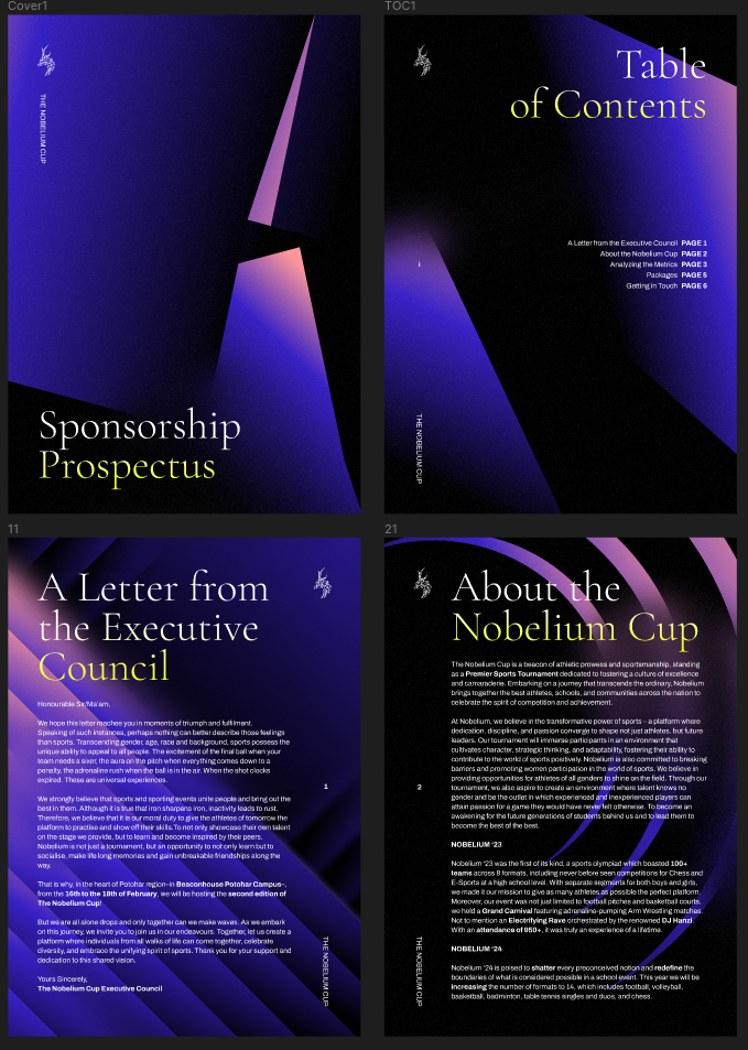
This is rather bland. The entire sponsorship proposal was a lot longer, but it was all text. Nothing else. We realized a bit later on that we could have done better. Better we did. In the week leading up to our event, for two potential sponsors (one of which was very promising but didn't work out).
This one is a lot nicer.
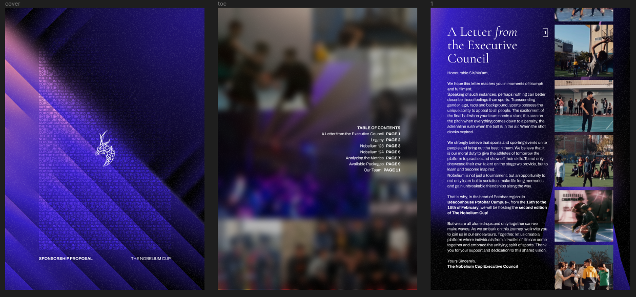
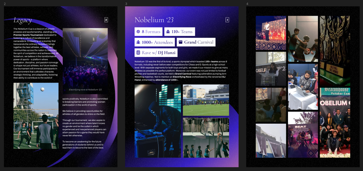
Not perfect though, but a lot nicer.
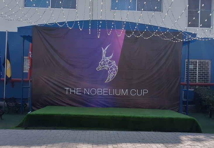
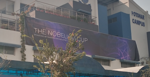
3.0: Banners
We did two banners:
4.0: Standees
A fair few standees too.
5.0: ID Cards
These are the ID cards for the host team. About 150 people in it. Same design for all.
I did not optimize for printing enough. Ended up looking like this (forgive the abhorrent photo quality):
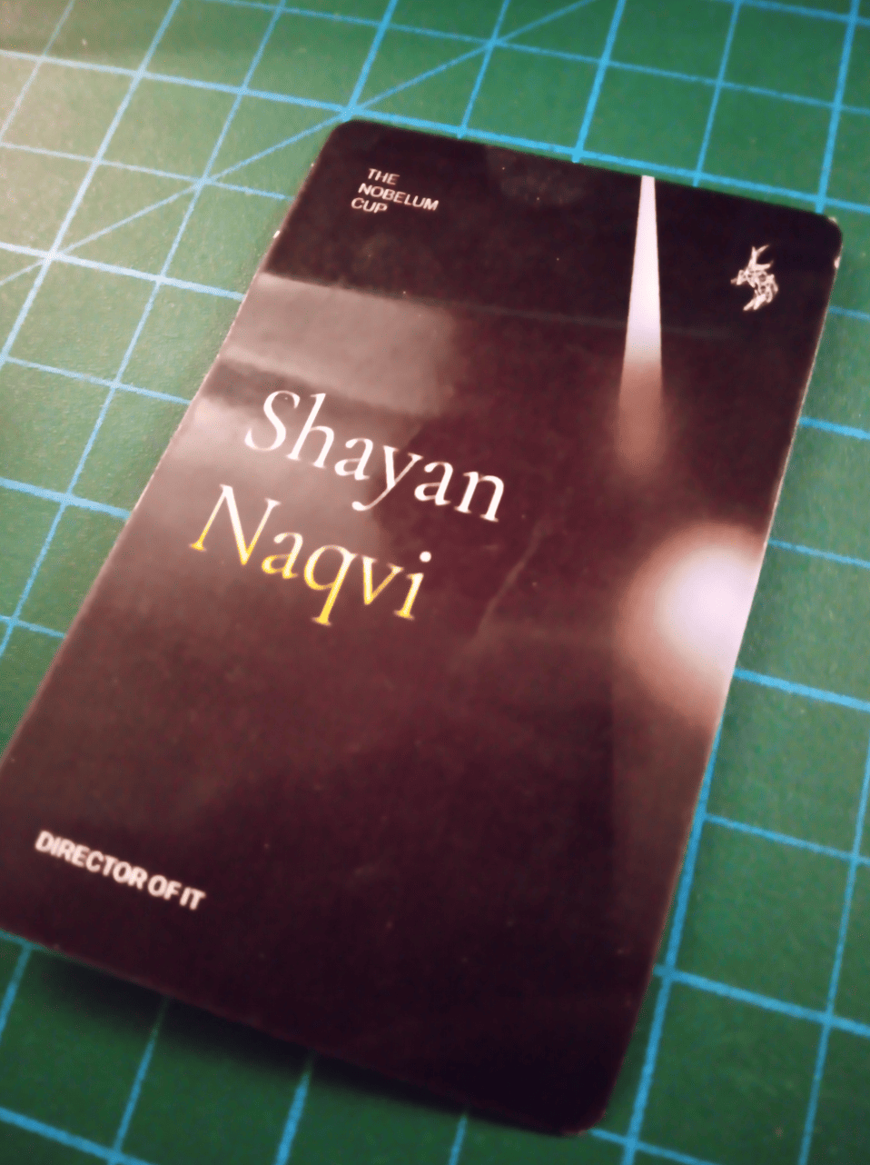
Text should have been larger. I'm going to experiment more next time.
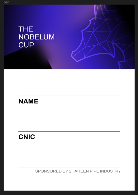
These are the ID cards for participants. Data was meant to be hand-written.
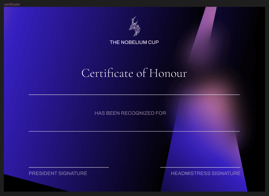
6.0: Certificates
7.0: Conclusion
As I stated before, net positive. This is the second event for which I've done this sort of work. Again, not everything went to plan. Not everything turned out exactly as I would have liked. But considering the kind of work I did for MSEM, there's something of an exponential improvement here. It's that much better to me.
8.0: Things I didn't use
I stared work on Nobelium either in late December or early January. I'm going to put up some of what I made but didn't use here.
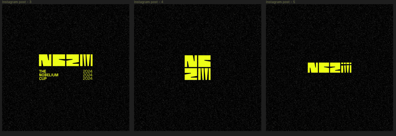
Some of the earlier logos:
The rightmost one is inspired from the Smash Bros logo. That sort of concept is something I really like, and I feel like it could use a lot more work. It has potential though. Maybe next year.
An earlier page-layout idea:
Was testing out using Cormorant Unicase as a header font in the middle row, the original idea was for a monospace font.
This was the most fleshed-out concept I had, and I still really like it. Needs work, of course, but I really like it and I'm 100% going to consider using it for next year's Nobelium.
ID card concepts in the same vain:
9.0: The end!
That's that.
This article was written on 19/02/2024. If you have any thoughts, feel free to send me an email with them. Have a nice day!